Here's the illustration of the logo which i've done in the adobe photoshop so i can see the full view of the logo itself in RGB,and proceed it to illustrator.

SHELL IN THE MAKING OF : STEP ONE

Well,in illustrator,the shape of the logo doesn't change much because i much prefer the shape in that way.Ok!Here we are!Firstly,I boot up my pc so I can run the AI application :P Next,i create a new blank document of 400X450px in size.
SHELL IN THE MAKING OF : STEP TWO

Okay,the next stage,i use the rectangle tool to make the background color.Double click on the canvas to get a fit size or set the size of the rectangle.The idea is to make the logo looks more professional by having a black background color.Maybe?
SHELL IN THE MAKING OF : STEP THREE


For this stage,i use pen tool to make those four triangles in shape.What about the color?I apply the colors by draging it from the swatches into the gradient panel.Firstly,i set the stroke to 3px.For the red triangle,the color gradients from #c7091f to #f0152f.Yellow,#ff7420 to #f7fa0c.Blue,#135aa8 to #64ccfd and lastly green,from #0a6a33 to #51f869.
SHELL IN THE MAKING OF : STEP FOUR

One step closer to the endline,i get those triangles adjusted by using Free Transform options to make the logo looks symetry.Next,i type out the company's name,SHELL as i did in my skecthing.
SHELL IN THE MAKING OF : FINAL TOUCH

Feel free to view :)
LOGO'S DESCRIPTION
1)the title of the logo
-The title of the logo is Royal Dutch Shell.
2)the meaning of the logo in local or cultural context
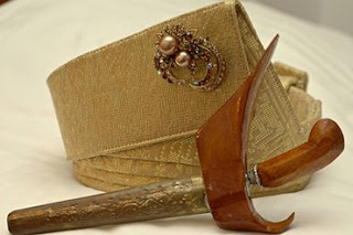
-The logo is based on traditional Malay headwears when performing Silat.The colors of the logo is based on the national flag of Malaysia.
3)the meaning of the shape
-The shape of the logo is based on the "Tengkolok",the traditional Malay headwears for men in Pahang as well as in Malaysia.The "Tengkolok" are put on during formal and public ceremonies where royalties grace the occasion.They are always an essential part of the costume of sultans and high palace officials gracing public ceremonies and official functions at the palace courts.The tengkolok is made up of four layers and we do have the view as the logo itself when we expand the Tengkolok.
4) the meaning of the colour
Green-Islam as an official religion in Malaysia.
Yellow-Respect for the Malay Rulers.
Blue-Peace and unity enjoyed by various races.
Red-Courage to overcome challenges.
White color -Malaysians’ moral pudity.
5)the relation to what the company represents.
-The shape of the logo is still stick with it's name and i just re-design the shape to looks more dynamic.I remained the Shell's original shape,the 'shell', which the company used to known as an oil company today.
TOOLS USED
I use Adobe Illustrator to design the new logo.From the application,i've learnt on how to draw shapes using Pen Tools which use mid point method to make lines.
I use Gradient to make color toning.


No comments:
Post a Comment